by Dan Woychick
 Once upon a time, there was a little girl with golden locks who was fond of breaking and entering. This is a story so familiar that most people would have no trouble providing the missing details or drawing conclusions about the protagonist’s questionable character.
When marketing communications miss the mark – when they fail to get it “just right” – audiences are unable and generally unwilling to fill in the blanks for you. They are left unmoved, puzzled, or annoyed.
Some marketing has style, but lacks substance. Some is as dry as the Sahara and just as hospitable. There are too many words, or too much white space. There’s not enough contrast, or the point size is too small. Can you make the logo bigger?
Like alchemists, writers and designers craft compelling stories by striking a delicate balance between familiarity and surprise. Our most common pitfalls occur when we favor what’s easy over what’s important.
Information vs. Understanding
When I was studying design in college, my professor prefaced a poster design assignment with his Rule of 20/10/5. If someone is standing 20 feet away from your poster, they probably won’t be able to read everything, but you want them to be able to absorb the most important information at a glance. At ten feet, your design should allow people to pick up additional details. At five feet away, you want to reward them for investing the time to thoroughly study your design.
Nowadays, whether it’s a poster, a website, or product packaging, writing and designing with a similar approach helps answer one of your audience’s primary questions: What’s the takeaway?
There is no shortage of data to be mined on any topic under the sun, but audiences need us to help them extract meaning from this overwhelming glut of information. 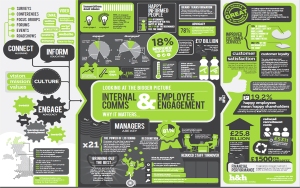 Into the breach, we’ve seen the popularity of infographics grow exponentially.
The problem is that most of them, like the one at right, cram a lot of information into a single space without actually adding any clarity to a complex topic. They are eye candy – if you like arrows and charts and little icons – or toxic if you prefer that design is used to advance understanding.
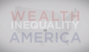 Compare the overloaded infographic to this video about income distribution in America, which deftly uses statistics to bring a complicated story to life. People are not inspired to act by reason alone. We must work harder to distill information into stories that have emotional resonance.
Certainty vs. Curiosity
One day, as a seven-year-old, my son declared himself the smartest person in the house. While he’s a bright young man, he was afflicted with a common cognitive bias known as the Overconfidence Effect – the difference between what people really know and what they think they know.
It affects all of us to varying degrees. In one survey, more than 90 percent of U.S. drivers considered themselves to be “above average.” 84 percent of French men estimate that they are above-average lovers. Without this misplaced confidence, 50 percent of those surveyed should rank above and 50 percent below the median.
How much confidence should we have in our own knowledge? And why does it matter for nonprofit marketing and design?
Adhering to common practices for the placement and display of information certainly makes systems run more smoothly, whether we’re navigating a website or an airport. Based on our online behavior, Amazon’s algorithms conveniently serve up a wide selection of things we may be interested in. But when we operate on autopilot – when we act with a degree of certainty that exceeds our actual knowledge – we can miss opportunities for deeper understanding and insight.
The best opportunity you’ve got to grow and to make an impact is to seek out the, “I don’t get it,” moments, and then work at it and noodle on it and discuss it until you do get it. – Seth Godin
Curiosity requires the humility to ask questions, to listen, and to incorporate new thinking. We should aim to be lifelong learners, like the computer science professor who worked a summer as a lowly intern for one of his former students just so he could find out “what the cool kids are doing” – and bring that experience back to his current students.
When curiosity becomes a habit, our recommendations are made on context, not conjecture.
Caution vs. Courage
In Minnesota, where I live, the locals are famously stoic. Blame it on our ancestors’ natural modesty, or blame it on the cold, but it’s the kind of place where “not too bad” means “good” and any display of excitement is tempered by fear of making a scene. We’re cautiously optimistic.
In a stable environment, risk aversion makes more sense. Conduct exhaustive research to better control and predict one outcome versus another. Seek to make the uncertain certain.
In a rapidly changing environment, like it or not, we’re asked to make many decisions without knowing every possible permutation. We need to recognize and accept our vulnerability.
What makes leadership hard isn’t the theoretical, it’s the practical. It’s not about knowing what to say or do. It’s about whether you’re willing to experience the discomfort, risk, and uncertainty of saying or doing it. – Peter Bregman
Courage is the willingness to do something when there are no guarantees. When we face tough challenges, we need to consider more than increasing the font size or the frequency of our social media posts. To encourage real progress – and not just fuss around the edges – we need to design changes to outmoded systems, not just play with pixels and paper. We need to encourage behavior change.
Invisible vs. Indelible
I have no easy fix for what ails traditional marketing and design. Most of the work has minimal impact. We need visionary nonprofit leaders. We need to rethink how we work. We need to expand perceptions of our value. We need to start today.
Will you join me?


